

Pure CSS, no JavaScript
The depth effect is the browser's native 3D projection of translateZ-positioned layers inside a perspective scroll container. No scroll listeners, no animation frame loops, no jank. The compositor does all the work.
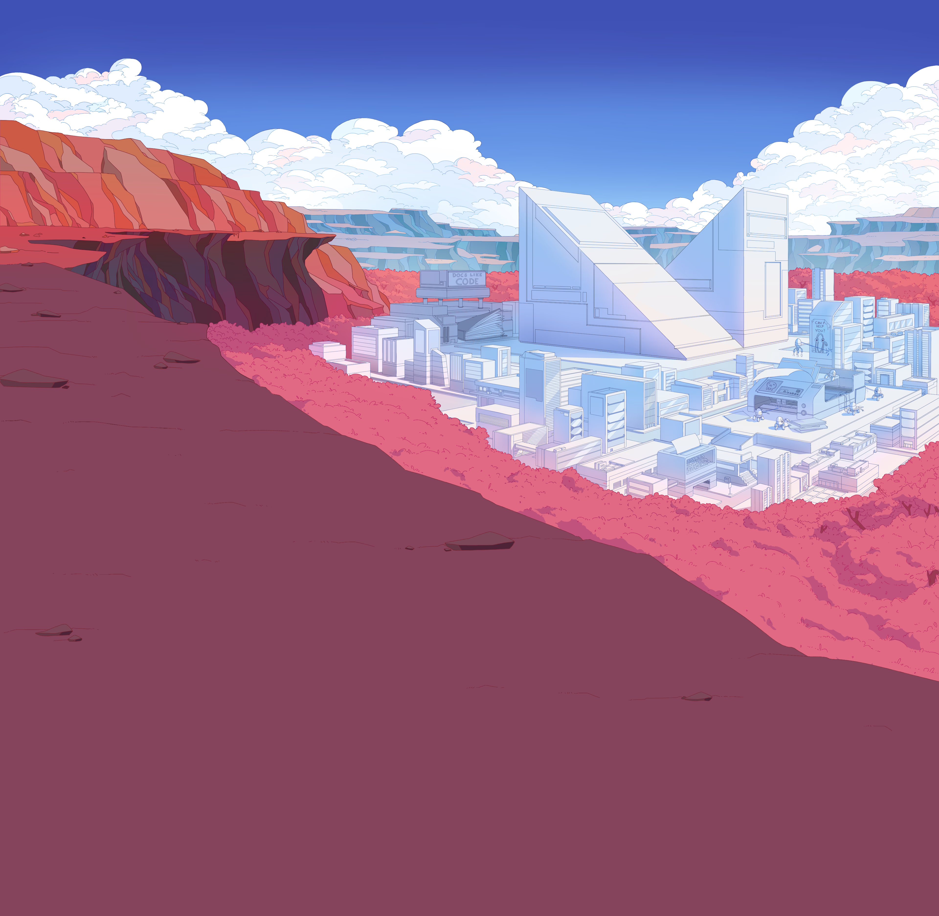
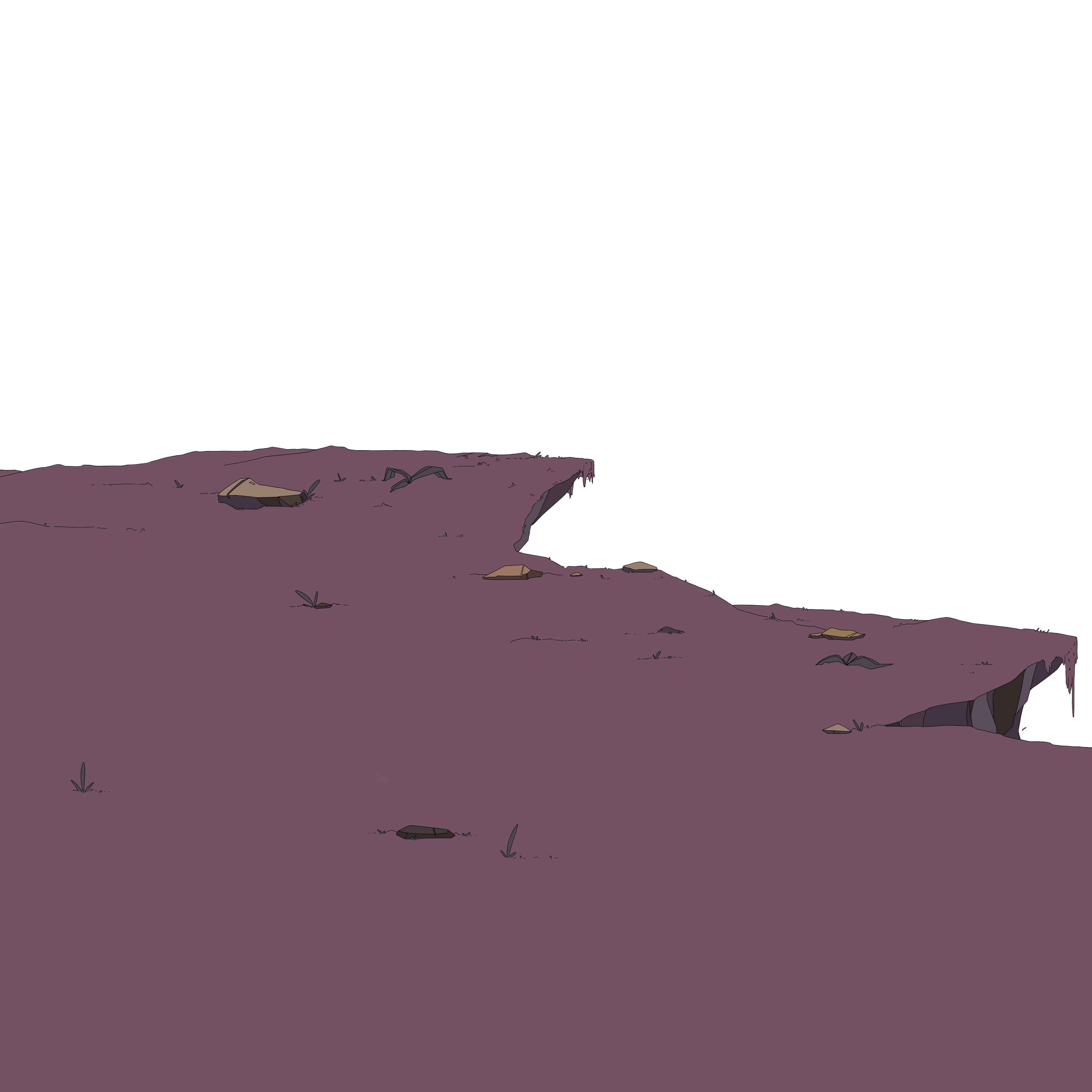
Four AVIF layers, ~600 KB total
Panoramic AVIF compresses 30–50% smaller than WebP. Four layers stacked at depths 8, 5, 2, 1 give a perceptible parallax range without bloating mobile load times. Lighthouse scores stay above 95.
MkDocs Material under the hood
Search, instant navigation, code-copy buttons, content tabs, admonitions, sticky tabs, dark or light themes. Everything Material gives you, plus the cinematic hero on top.
How it works
A scroll container with perspective: 2.5rem establishes a 3D context. Each layer is pushed back with translateZ and scaled to compensate. Layers further from the camera move slower as you scroll — the parallax is the browser's projection math, not a simulation.
The technique was originally built for Material for MkDocs. This repo is the standalone extraction: documented, scripted, and ready to drop into any project.
Read the deep dive →Quickstart
Pick a host, click deploy, swap the four hero AVIFs for your own. The site is live in under five minutes — no account beyond your deploy platform, no JavaScript framework, no build pipeline beyond mkdocs build.
- Fork the repo via "Use this template"
- Click a one-click deploy button (Vercel, Netlify, Railway)
- Replace the four AVIFs in
src/assets/hero/with your art - Edit hero copy in
overrides/home.html— push, deploy auto-updates